
Once you’ve established your business and successfully secured your website’s domain name, it’s time to build a captivating landing page and generating leads. Landing pages are one of the most effective ways to gather valuable data and engagement from your website’s visitors because they are extremely easy and cost-effective to create—not to mention effective as well!
Virtually every industry today uses landing pages to serve a wide range of commercial purposes. Due to this high level of diversity, there is no one landing page design or formula that’s guaranteed to work for everyone.
Your best course of action is to instead gain inspiration from existing examples and understand the core factors involved to design your own effective landing page.
So, without further ado, here are 21 Top Landing Page Examples to Inspire You:
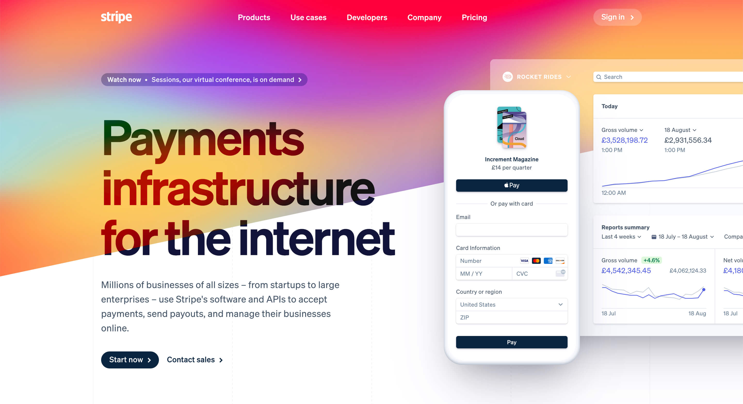
#1: Stripe
Stripe offers business-ready payment processing as well as advanced tools such as invoicing and complex API implementation. This highly effective landing page includes clear text that outlines the core purposes of the platform.
The site immediately explains more about Stripe's solution, and uses a dynamic background that makes each fold look subtly different and encourages visitors to continue reading. Stripe has kept its aesthetic consistent through the use of recognizable brand colors, shapes, and a fun, engaging layout.
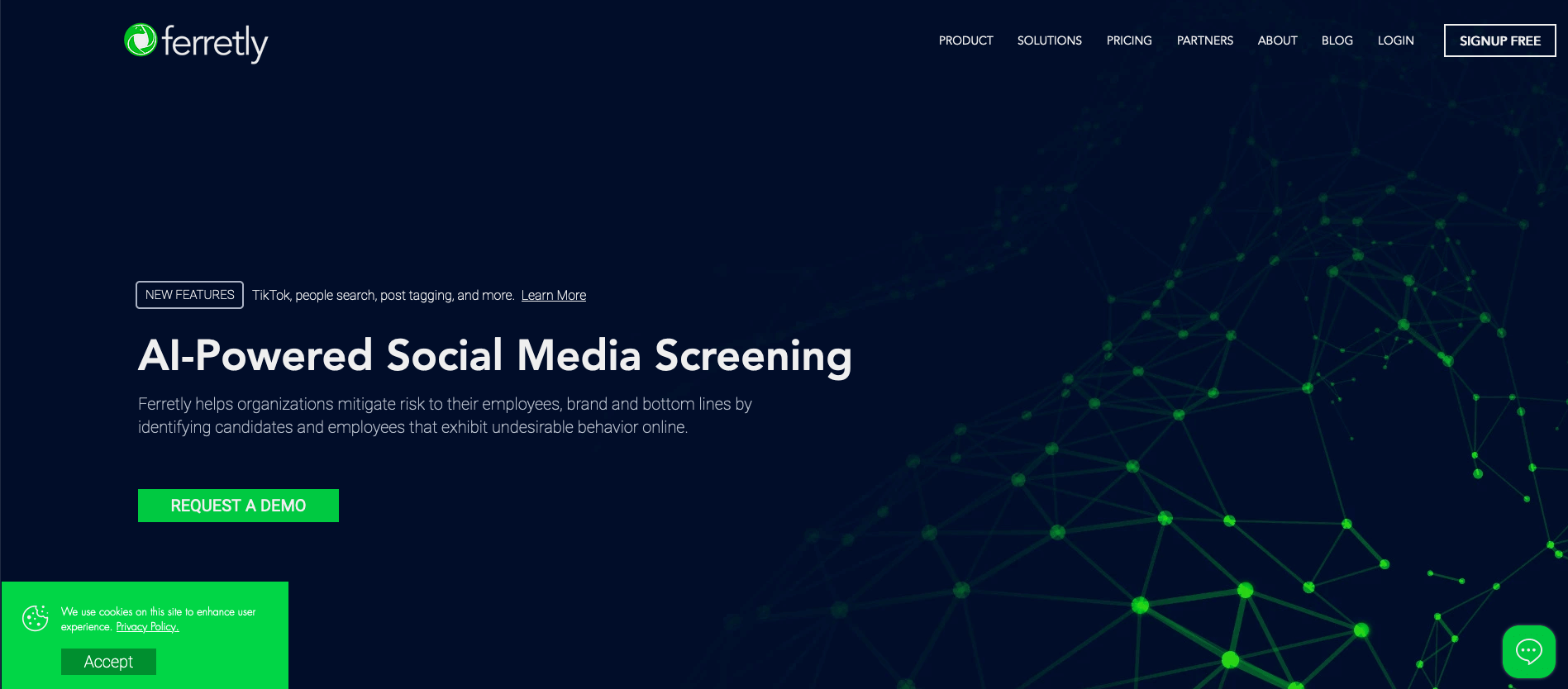
#2: Ferretly
Ferretly’s Wix-based site offers several professional features, including a prominent live chat button that moves down the page as visitors scroll. The site’s top fold answers common questions that most visitors will have, starting with an eye-catching header, a detailed explanation, and a call to action.
They split the rest of the landing page into brief, bite-sized sections that explain the many benefits of using Ferretly’s services.
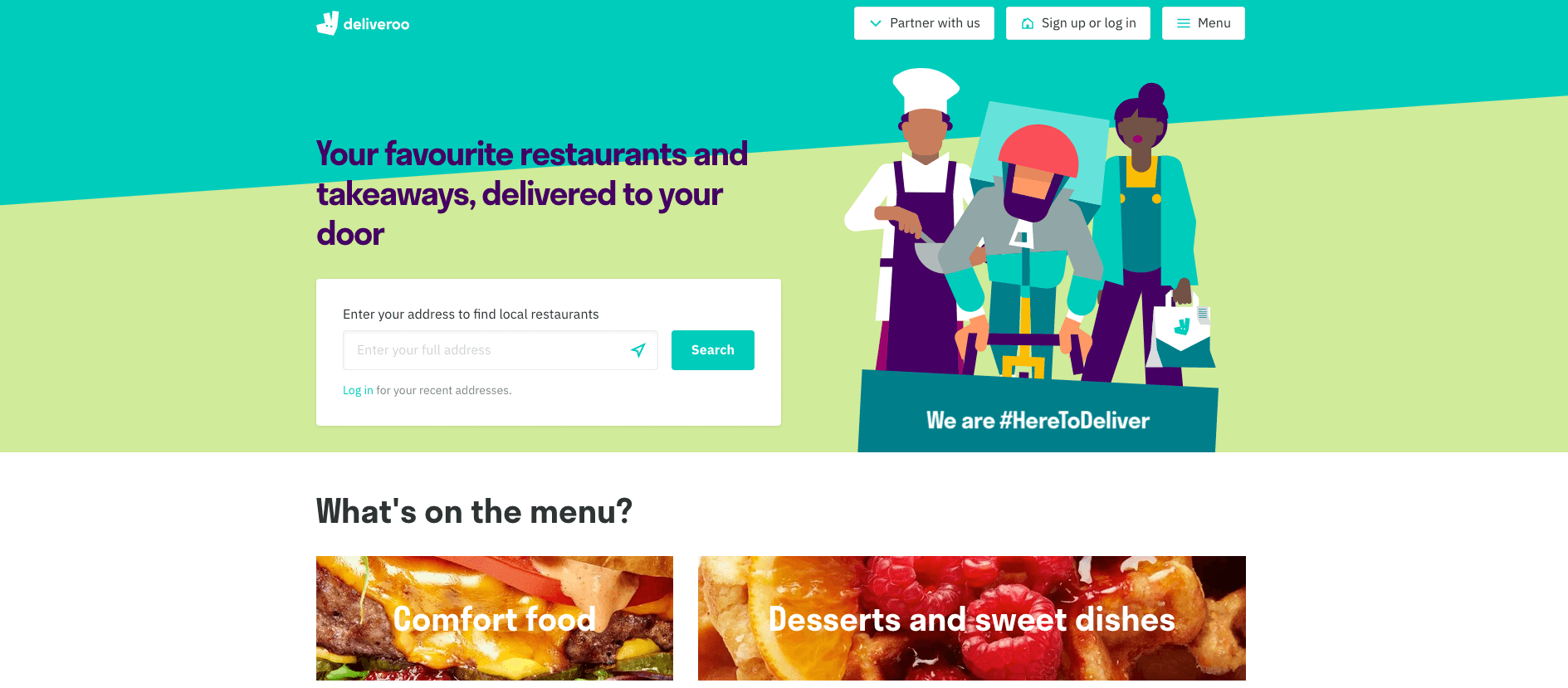
#3: Deliveroo
British food delivery company Deliveroo’s landing page targets customers looking to order food online.
The page features an easy address search function and has the menu functions conveniently split into sections, with mouth-watering images on each button.
The landing page is full of information not just for customers looking for a takeout meal, but for restaurants and suppliers who want to work with Deliveroo too. Although it’s chock-full of info, it never feels cluttered and is incredibly easy to navigate.
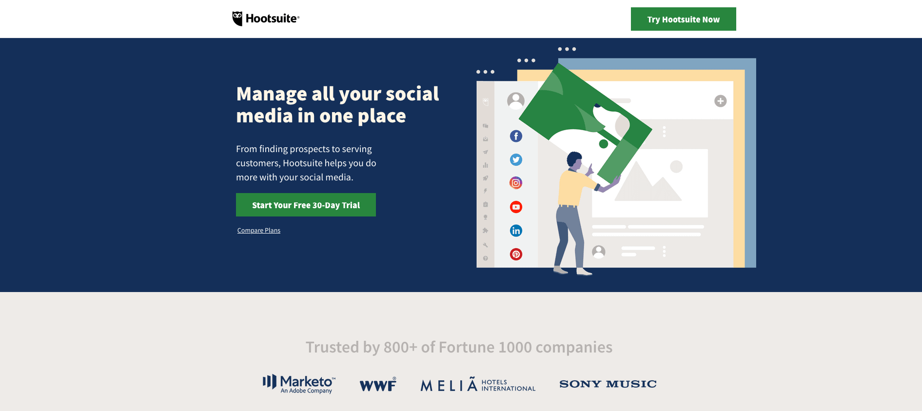
#4: Hootsuite
Hootsuite offers an extensive selection of social media management and marketing tools. The brand’s landing page uses illustrated screenshots and relatable copy to explain exactly how they benefit the businesses that work with them.
Their landing page branding is vibrant and fun, much like social media, but it incorporates a professional approach and numerous reviews and CTAs. They’ve made their top fold bold, clear and straightforward, ensuring that users immediately understand what’s on offer.
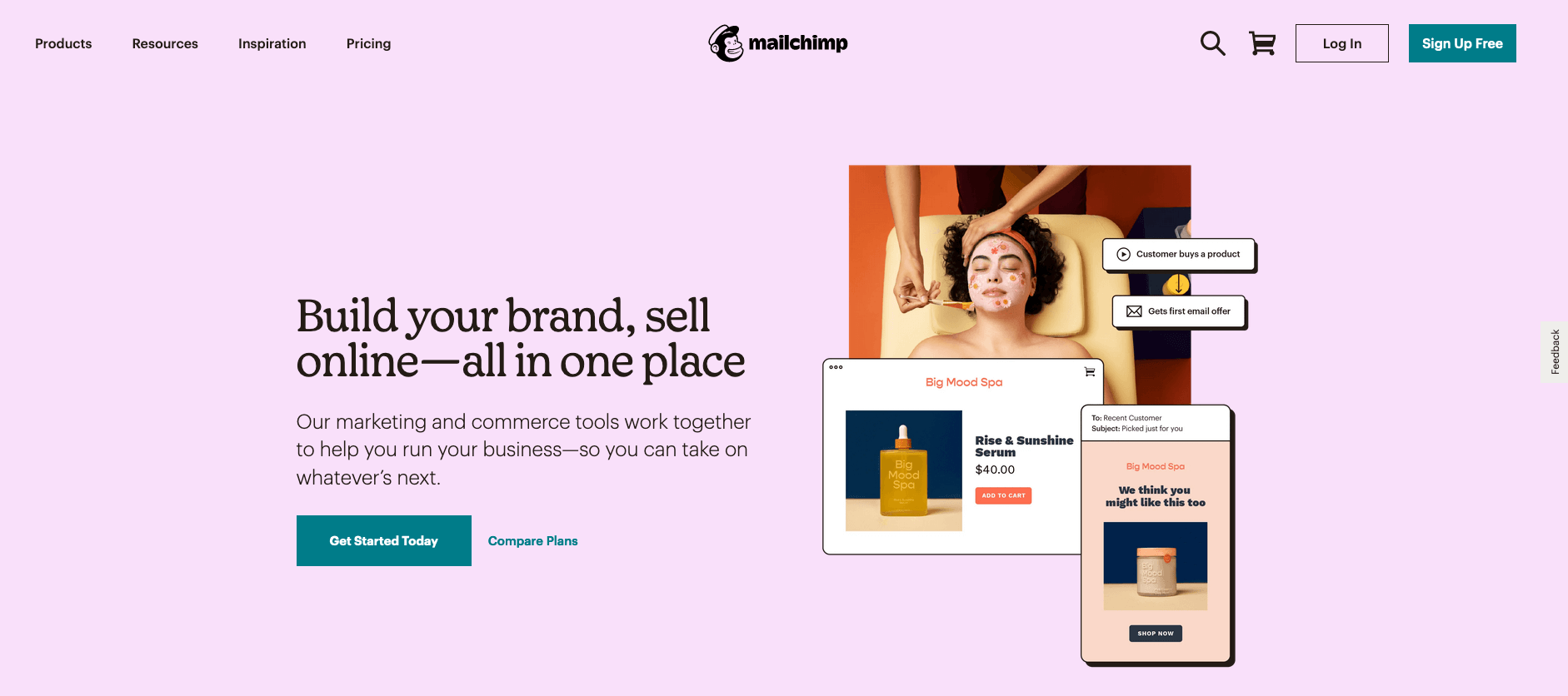
#5: Mailchimp
Mailchimp is the world’s largest marketing automation platform—a fact that is immediately made clear to visitors at their landing page. The brand uses bold black font on a simple pink background to grab visitors’ attention, and then immediately positions itself as an acclaimed email marketing service.
This landing page is also successful because it displays its strong CTA, ‘Get started today’, in multiple places in view.
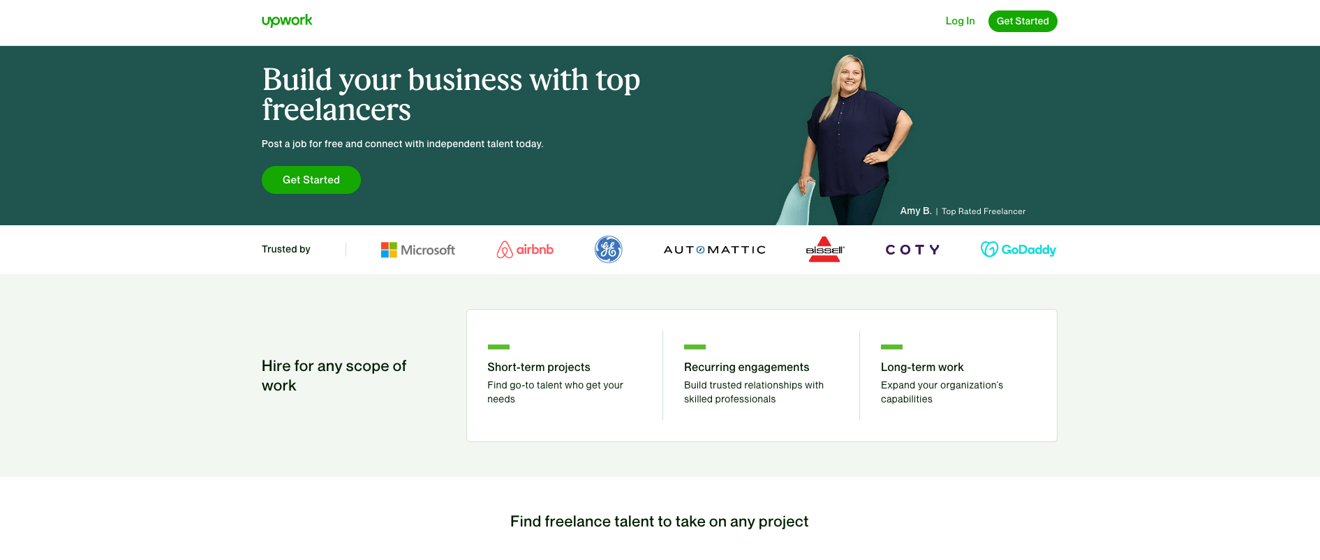
#6: Upwork
The success of Upwork’s landing page lies in its clever CTA buttons and its uniquely motivational on-site copy. The freelancer job-seeking hub makes it obvious from its call to action button designs it aims to attract freelancers and businesses to register on its platform.
Upwork’s copywriting is highly directional and uses creative language to reinforce its market position.
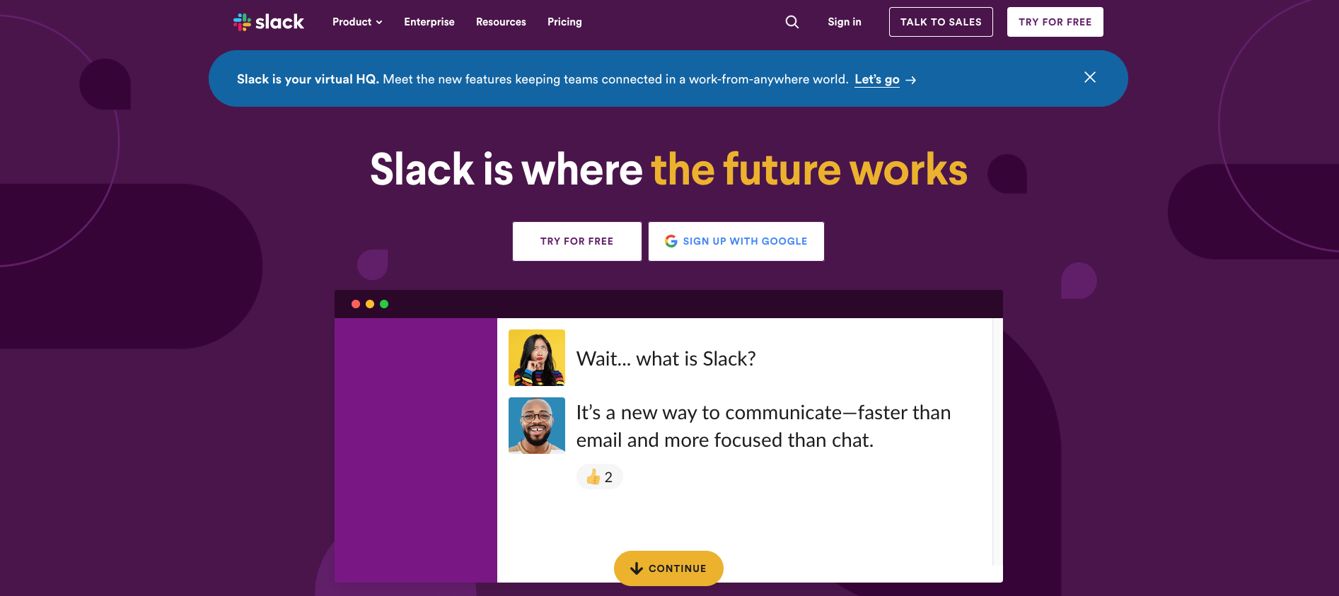
#7: Slack
Slack’s bold landing page header—‘Slack is where the “future works” immediately tells visitors it is a digital workspace service.
The landing page’s design has an eye-catching purple and cream color scheme complete with a few simple illustrations to enhance its impact. The CTA button, ‘Try for Free’, is short, direct, and persuasive, as is the ‘Get Started’ option.
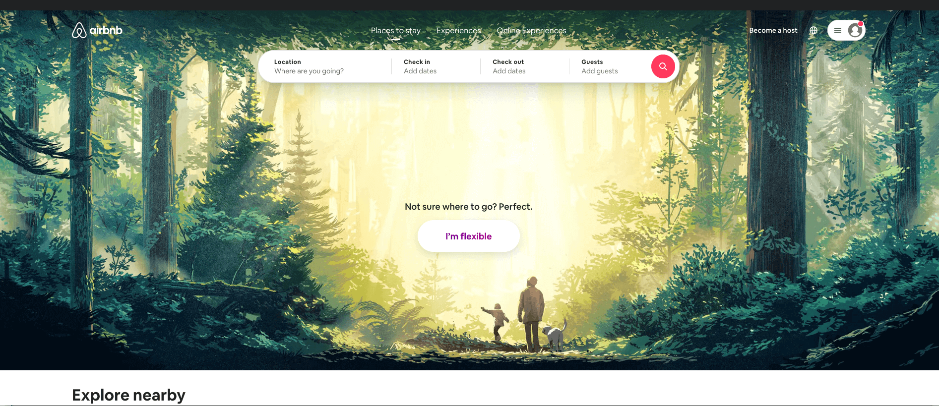
#8: Airbnb
Airbnb’s landing page is characterized by a photographic background, personalized displays, and positive word-of-mouth reviews.
Visitors to the site can add more personal details to the search field to get instant, customized estimates.
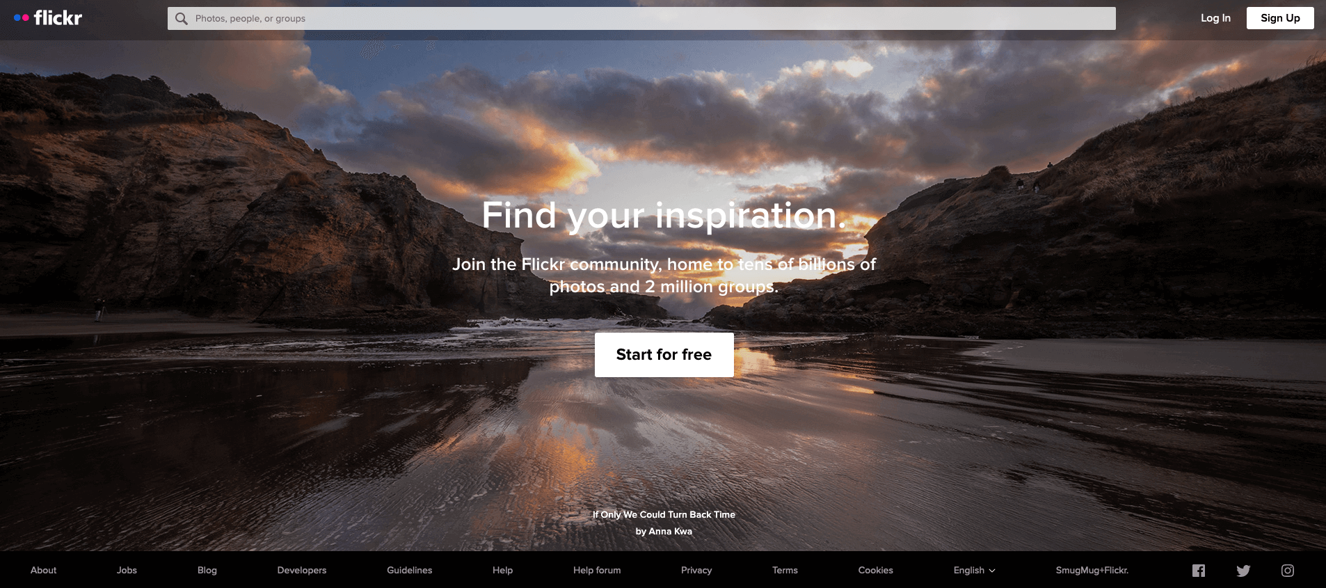
#9: Flickr
Photo storage and sharing platform Flickr offers an attractive landing page with a picture carousel that showcases its photographers’ work and a large, easily visible CTA button.
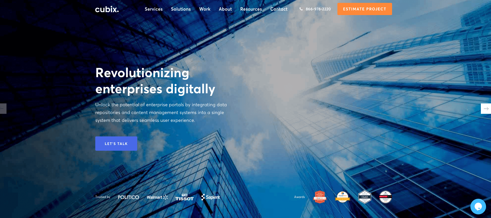
#10: Cubix
Cubix’s landing page is simple, clear, and easy to use and to navigate. It contains goal-oriented calls to action that stand out amid the minimalist site design.
It’s “Let’s Talk” CTA is clear, and it builds trust by displaying the logos of some of its prominent partners.
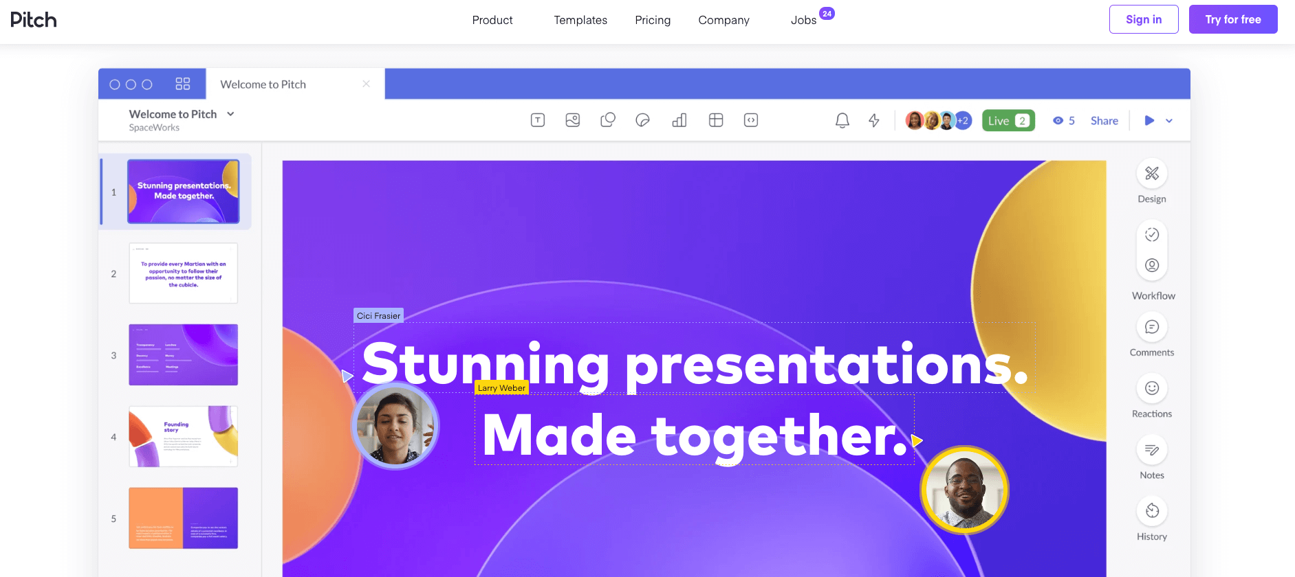
#11: Pitch
Work collaboration platform Pitch’s unique 3D graphics and animated designs look especially eye-catching against the site’s simple white background. The page offers easy and clean navigation without clutter or large walls of text.
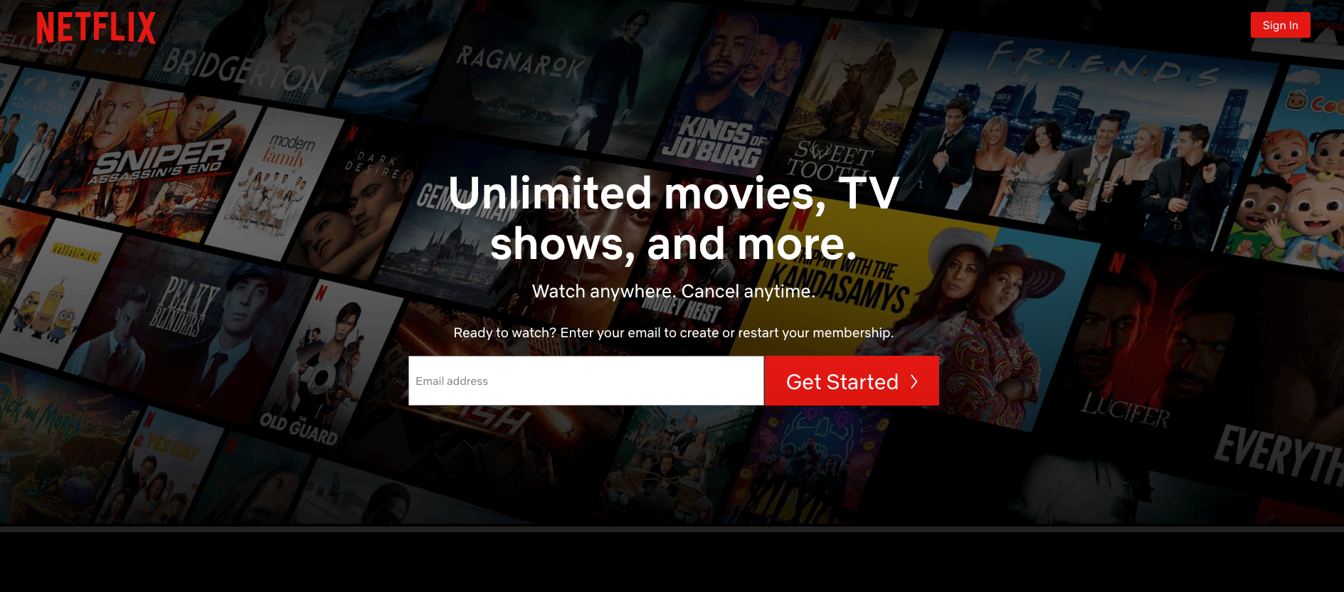
#12: Netflix
Netflix’s slick design makes it abundantly clear what it offers, and it stands out from the crowd with its simplicity.
Despite having a huge amount of important information, it’s incredibly easy to digest. It’s “Get Started” CTA encourages users to enter an email address, immediately forging a connection to the service.
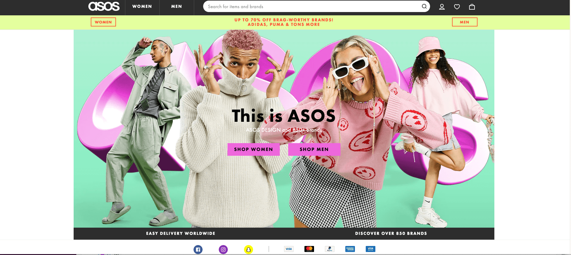
#13: ASOS
ASOS landing page is divided up into brightly hued blocks and accentuated by fun carousel images that showcase some of the available fashions. The simple yet striking design clearly targets shoppers and includes social media icons and popular payment gateway logos that are small yet quickly stand out. What more could shoppers want all in one?
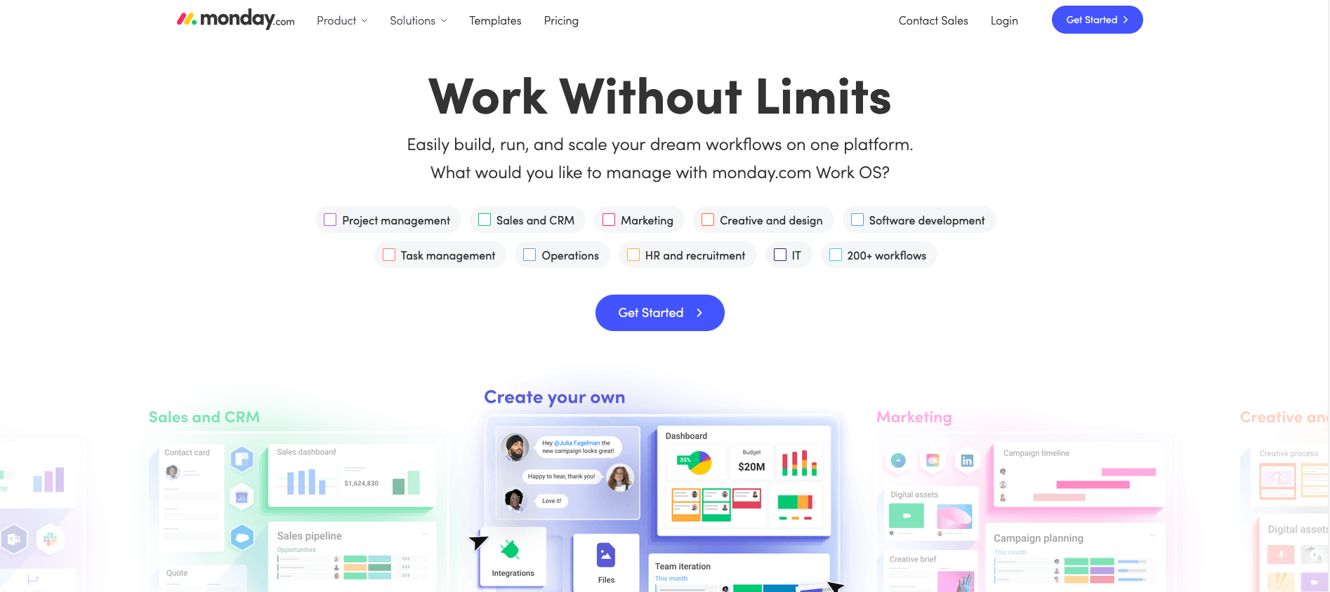
#14: Monday.com
Minimalist landing page designs are set to be a major website design trend in 2022. Monday.com provides great inspiration with their simple, clean, and easy to navigate landing page.
The site concisely describes the services on offer and displays examples of its project roadmaps to show visitors the services they can take advantage of if they sign up.
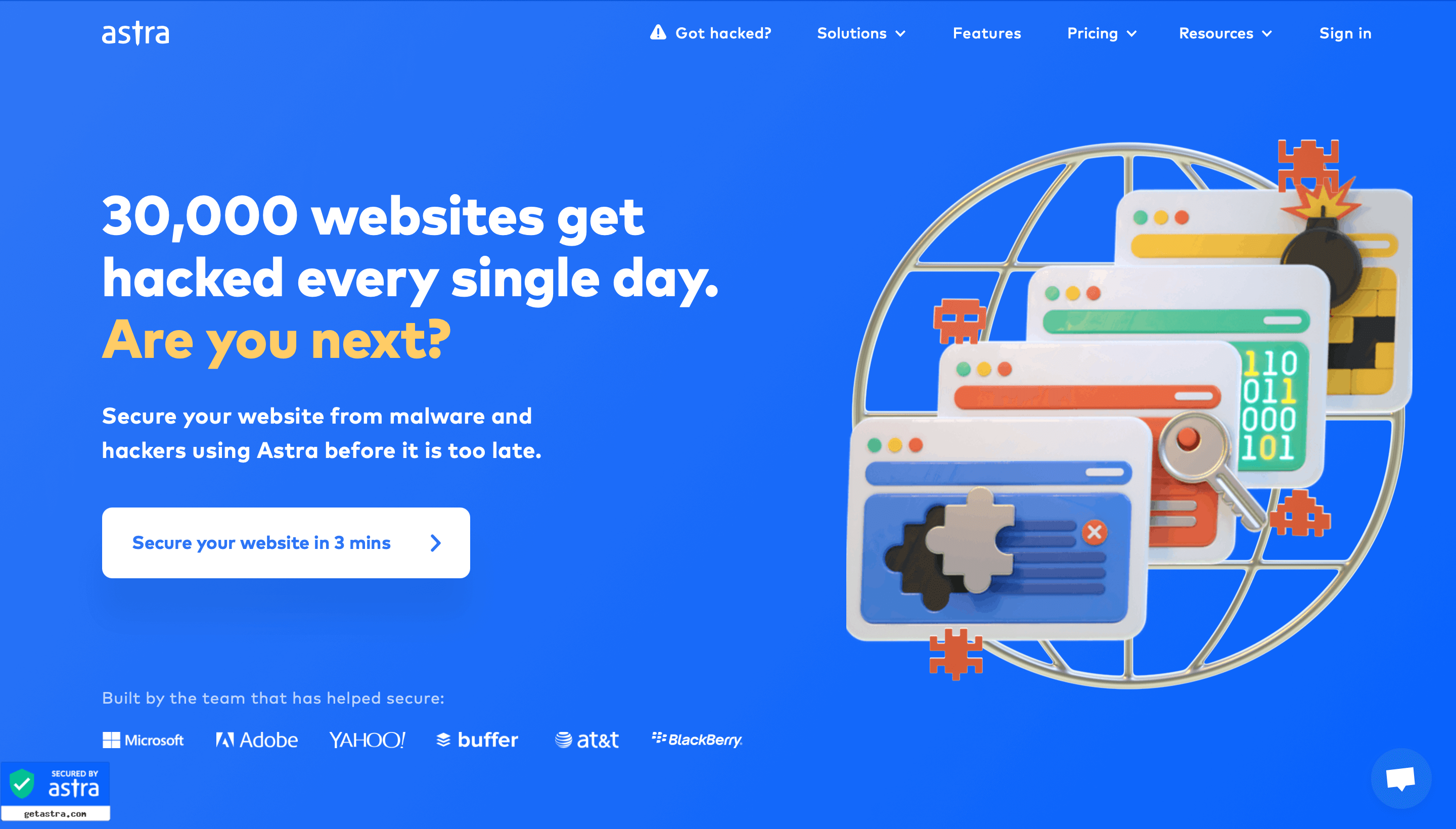
#15: Astra
Astra’s sky blue landing page immediately brings up a relevant pain point for online businesses and then positions their services as the solution to website security issues.
Their CTA is very specific and time bound, and they refer to major past clients like Microsoft and Adobe at the bottom of the screen to build trust with potential customers.
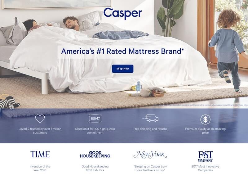
#16: Casper
US mattress brand Casper’s landing page immediately establishes the company as the leader in its sector with a unique selling proposition. It refers to popular media houses for social proof, and keeps its landing page design simple, neat and responsive.
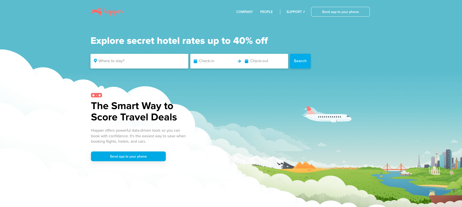
#17: Hopper
Travel app Hopper’s landing page is simple, easy to read, minimizes the use of text, and instead draws visitors in with fun illustrations and playful CTAs.
The landing page is optimized for desktop and smartphone browsers, and always redirects users to a link to download their popular mobile app. This site showcases UI and UX design at it’s best, with the interface being incredibly easy to navigate and the overall browsing experience simple and seamless.
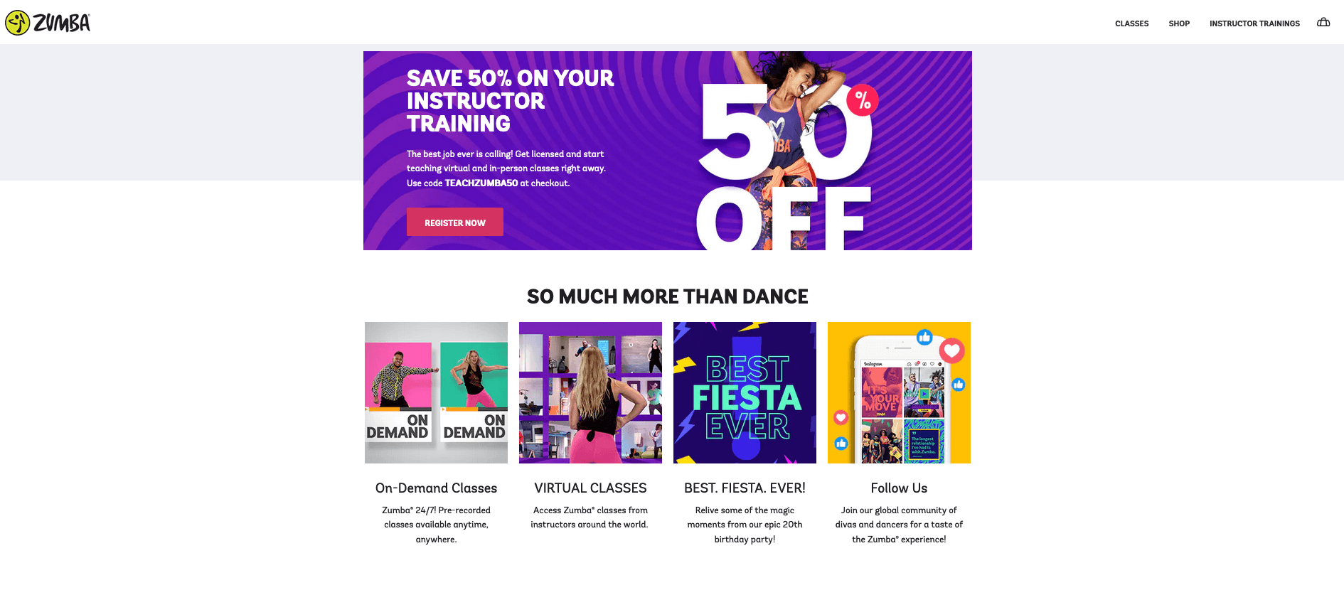
#18: Zumba
If ever a landing page exuded energy, then Zumba is it. The active photography and supportive text makes it immediately clear what’s on offer in an upbeat and exciting way.
The vibrant graphics contrast perfectly with plenty of white space and there’s a happy, healthy vibe—exactly what they're selling.
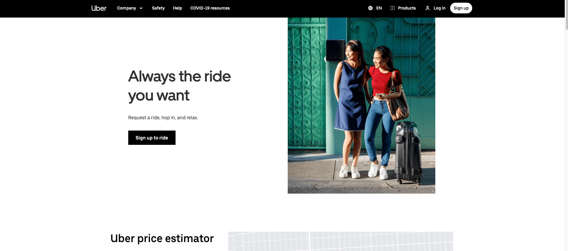
#19: Uber
Navigate to Uber’s landing page and you’ll be greeted with the immediately recognizable logo and a tagline advertising ‘Always the ride you want’. The ‘Sign up to ride’ button stands out clearly against the white background.
Scroll down and you’ll find useful features like ride estimators, details about the different services and cars and safety features. There’s also the option to download the app, making using Uber easy and quick.
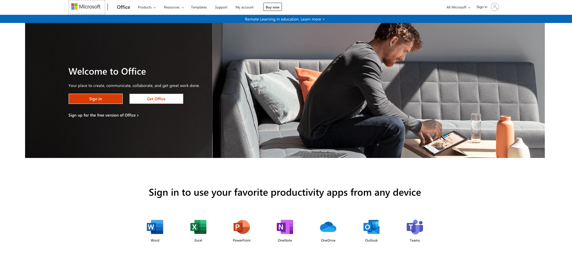
#20: Microsoft Office
Microsoft Office’s page headline is benefit-based and instantly tells visitors how their teams’ productivity will increase by using their products.
The simple layout allows visitors to quickly read relevant information, and the various services are clearly defined to allow for easy click throughs.
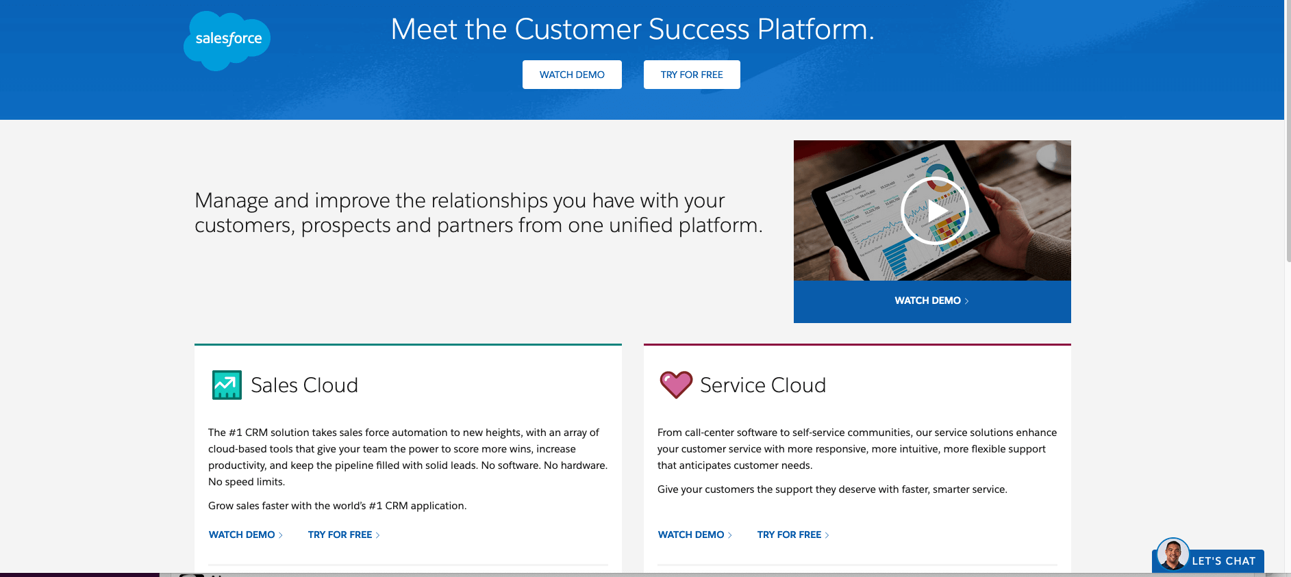
#21: Salesforce
Reporting self-service app Salesforce’s landing page clearly outlines the issues with managing customers, prospects and partners and names itself as the solution. Its copy is minimal and straightforward, and there are clever directional cues for watching a demo or getting in touch.
The site features logos of trusted brands that use their service and trust badges to instill trust and confidence in prospective customers.
Even the best web developers need some inspiration from time to time.
These 21 examples are a great starting point for your landing page design.
What do you think of these landings? Let us know in the comments section, below!
Hi!
yes, the Landing Page is very important in the website. It creates an overall website look. good Article,
Thank you,